
5.
HOW TO CHOOSE THE BEST COLORS FOR YOUR PRESENTATIONS
Choosing
the right colors for your presentation can quickly become a surprisingly
difficult task. Its easy to know when color combinations dont look good, but
its tougher to figure out what actually works. If you dont know where to
start, here are a few things to keep in mind the next time you begin to design
your presentation.
WHAT NOT TO DO
The
Vibrating-Color Headache
Vibrating color combinations are colors that give the illusion that they are
vibrating on screen. Not only are they ugly combos, but they can actually give
people headaches and have been known to even make some people nauseous. If you
need to use bright colors, always use them with a complimentary (neutral)
background.
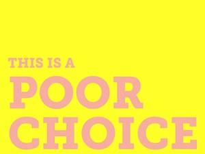
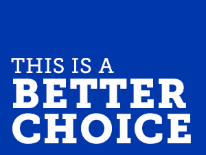
Low Contrast
Colors
While subtle color contrast can be great for print design, it rarely works with
presentations.
A
projector is limited in the colors it displays, therefore, colors with little
contrast can easily be washed out and invisible when projected. I recommend
always using high contrast colors when designing a presentation that will be
viewed on a projector.
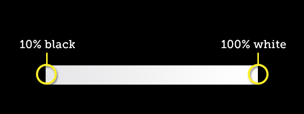
Not So Black and
White
Print design can look professional and elegant when only using black and white,
but in a presentation, black and white generally look boring and as if little
thought was given to the design of the presentation. If a black and white feel
is needed, I recommend adding a subtle gradient to blacks and whites to add a
little depth/interest.
WHAT TO DO
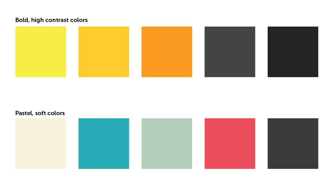
The Emotional
Power of Colors
Colors possess many emotional connotations. For example, the color red can
infer anger or frustration, but when used as an accent color (lets say a
white/black/red color scheme), it can provoke feelings of power, excitement or
confidence. Another example is blue. Blue provokes feelings of trust or
calmness, which is why many medical companies use blue in their brand color
scheme. However, blue can also infer sadness or boredom. My advice is to choose
a color scheme that fits your material (i.e. strong, high contrast colors for
tech/innovation; pastel or dulled colors for emotional, human material),
and stick with it.
Stay Trendy
One of the best resources on the web right now is Kuler.
It is a fantastic color resource. You can create your own color schemes (choose
a base color and Kuler provides a color scheme, based on the base color) or
search their gallery or color schemes uploaded by users. Its a great place to
stay on top of color trends to see what will be best for your presentation.
Go Online With It
Color Scheme Designer is another excellent color-scheme site
similar to Kuler, except it gives you the ability to view examples of what your
chosen color scheme would look like on a website like SlideShare. It also has
the accented analogic color option, which provides an analogic color scheme
with a complimentary accent color.
Presentation
color selection matters. Choose wisely.